Dart Manipultion

Today, we started our support module for fashion construction. I was really excited to start this because I really enjoy sewing and I like learning how to make new things.

We started by looking at how to move simple darts, a neck dart, a side seam dart, and an armhole dart.To make these, we had a mini bodice block and we had to make a mark where we wanted to move the dart. We started from that mark and drew round the block clockwise until we hit the first dart. We had to close the dart by putting the pencil in the bust point and moving the block anticlockwise so the other dart point is where the first one was. We then continues to draw the block until we hit the other dart and did the same thing. We continued round until we got to where our new is going. We connected up the gap and connected it with the bust point. After we had done 2 or 3 of these, they started to get a lot easier to do.

After that, we moved on to doing a diamond insert dart. This sounded really tricky and I was quite worried about it. Instead of drawing round the block like last time, we had to do the cut and stick method because it was easier. We started by drawing round the whole block, including the original darts. We then marked where we wanted out diamond to go and cut it out. We then closed the two original darts by cutting along them then sticking them shut.

IMG_0340

After that, we had a go creating asymmetrical curved dart lines. We started this one on the fold of the paper so we had two halves. We drew round the whole block, including all the darts. We then used a tracing wheel to follow the lines of the darts so we can easily draw them on the other side of the paper. We opened up the whole piece and started to draw in our new curved darts. One of the lines is drawn from one bust point to the opposite shoulder. We did another curve from the other bust point to the side seam. We then cut along the new dart lines and closed up the old ones.

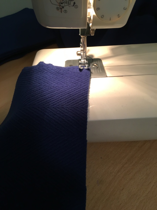
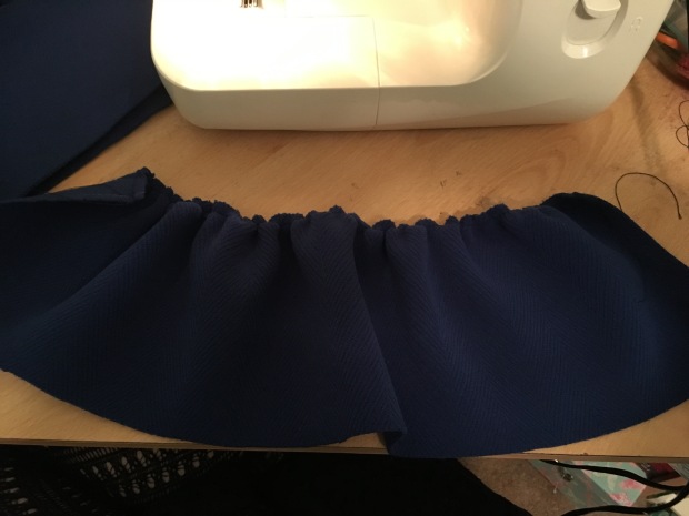
After, we pinned them to the material and cut them out. For the neck dart piece we turned it into gathering at the neckline by curving out the neckline more. We pinned them down and cut out all the necessary pieces. We started with the gathering at the neckline by gathering between the two dart slits. After that we did the curved darts. We had to pin the two sides together then carefully sew along the lines to get the curve. The diamond insert dart was the trickiest. We pinned the diamond on one side of the bodice, we sewed one edge then pivoted at the corner so it was all moved round the sewed the other side. We did the same for the other side of the diamond and sewed the front seam together.

New Project

This week we have started a new project. We started by being given 3 different briefs that we could choose from. The first one was designing childrenswear for Next, the second was women’s sportswear for Marks and Spencers and the third one was designing textiles for Oasis. To help decide what brief we wanted to pick, Tania Bines came in again to talk to us about what goes into designing childrenswear (Click here for her first visit). She brought in some of the design specification sheets that they use at Paul Denicci, and some of the clothing that they had designed.

I chose the Next brief, I was drawn to the brief straight away and really excited to get into designing something different because I have never tried designing children’s clothing.

After we had picked our brief, we were given a S/S 17 trend. For childrenswear there were two trends, one for boys – Digital Wave- and one for girls – Encounter Culture. I liked the idea of the digital wave trend because the pages we were give were very brightly designed and I liked the idea of designing boys clothing because I wanted something unique and most people chose girls so I wanted to be different. I created a few pinterest boards about the trends to get an idea of what they were like and which area I wanted to go down (S/S 17 Digital Wave pinterest board). After looking at some the pictures, they started to remind of me of space and futuristic themes, as I created a board on space after that (Space Pinterest Board).

For the rest of the day, we had to go to our chosen store and photograph some items of clothing and look at how they are made and out of what. I went into both the store in town and the one at Tollgate. I had to photograph some of the collections of clothing that they had. I chose this one because there were a lot more colours used and more of a range of items of clothing. I found out that they have a lot of theme clothing in the boys section, these ones are minecraft and Marvel.

After that, I went to Debenhams and looked at some of the higher end clothing companies in there to compare them. I looked at the Baker by Ted Baker collection. I thought the collection was quite cute, but I did think it looked very stereotypical, lots of blue and greens and prints of cars. It was also the same in the girls side too, it was very pink and there were lots of floral prints.


Camilla cuzner- Charles, Accessories Designer

Has worked in accessories for 12 years
Worked in London for 8 years
Worked in for NY 4 years
Working in accessories means that it’s challenging and there are a range of things you can work on.
Work history
Did a placement at Brighton University
First was a print job – was fired within the first week
Second job, same happened
Third job – did everything she possibly could and helped out – DKNY
She got work placements from friends of friends and from other jobs
She studied at The Royal college of art – knitting- likes the concept of knitting, the interlocking shaped, moved onto interlocking shapes – tiles, Islamic patterns, Lego
RCA final show – Designed a leather bag using diamonds and stars, interlocked into each other. She started to play with other materials, very stiff leather, acid resist copper,
Shopping bag – interlocking rectangles
Started thinking about folds
Origami – shuzo Fujimoto, twist origami
Le Klint – lamps
Modular origami – satori
Folded metal stars – made into a chandelier
Had to move back to knitting
Started to use a knitting machine, Moral machine, a digitised knitting machine, scan on pictures and it would knit it.
She used knitted silver and grillon bonded to leather and cut into interlocking shapes, when folded, it meld its shape
Moral machine, digitised knitting machine, scan on pictures and it would knit it
Graduated in 2004
She then heard from Bill Amburg, a bag commissioner that wanted to sell her bag ideas.
She found out later on that her bags aren’t made for commercial products because there is too much leather, cuttings and hand work.
Liberty 2004-5
Worked with all kinds of a products
Embossed leather travel bags
Embellished metal scarves
Wants everything to be luxurious
Press- living etc, embroidered pillow
ES magazine – embroidered scarf
Paul Smith 2005-2010
The Paul smith brand swirl and stripe print
Work from massive design boards – hats and scarves, visual mind map
Tech pack – what is given to the factory to make the product
2008 financial crisis and the power of accessories
New York – American Eagle
Like gap but for teenagers
Fully commercial environment
Designed into the price
Kate Spade
Quirky
Design into price tiers
Has a certain amount of money to spend on each tier
Now does free lance work
‘Creativity is greater than money’
University of Brighton
Last year was a year in placement, in the industry
The tutors help you do it
Stay in touch with people in the industry
Talk to your tutors- they know people
Summer holidays work
It’s the better the experience that you’ve got, and how likeable you are
Start from the bottom, make the cups of tea
Collection designing
Kate Spade
Main designer would get a colour palette and theme
Everyone in the company in different departments would get the same theme and palette
Make a trend board, what competitors are doing, high street, anything inspiring
Keeps you focused
Meet with the buyer
Good, better, best categorising
The best one is luxury and what it given to the press, shows what the company is about
Make sure all departments tie in together, all intentional
If the designer was 10 items they would design 30 items for them to pick
Tech packs – all the designs, materials, accessories, the label, the sizing, all sent to the factory so they know what they are doing
6 weeks later, Sample is sent back from factory, everyone would say opinions
6 weeks after, final sample is sent back
All final ideas are made then and everything is made perfect
Final tech pack made,
200-300 pieces worked on at any season
Keep all the pictures and ideas so that they can be referred to later on
Photoshop and illustrator is important
In design, taking over the world, learn if possible
A range of hand drawing and computer drawing in portfolio
RCA
Do a whole project for them
Getting grilled on what you have done and why, very tough on you
Working for different companies that have different styles to yours and to other companies
Will work with buyers closely
British companies – creative lead
American companies – buying lead
Went to China
The conditions
They have to make the same thing for months
Only have certain times for toilet breaks, and if they don’t go in that time then they had to wait for the next break.
Like old industrial revolution
Went to Italy
Misoni factory
Out for lunches and dinner
Take pride in the work that they do
I found this chat with Camilla really interesting. It was interesting to hear about how the different companies work. The companies that she worked for in the UK were very high end and they worked by making very expensive and extravagant items. However, the companies in America were run very different, and were more about money and not working over the limit. I also liked to listen about her time in New York because it opened up more opportunities to think about and if I ever wanted to move away.

Drawing Processes Sketchbook

IMG_0010

I started off by looking at a dress that my sister has. I had a lot of tulle and netting in the skirt so I thought it would be perfect to draw with my theme of wedding dresses. I started off using a white pencil to sketch it out. I thought it would help me get some depth in the many layers, however I think it looks too hard and too light to understand that. I think it makes the drawing look boring because the colour is dull and doesn’t stand out enough. However, that could be expressing the material because tulle is very thin and once it is layered together it does become hard to see.IMG_0011

I decided to move onto ink afterwards. I used a yellow ink. The yellow was very vibrant went it was used on it’s so I used it for the swirls of the lower part of the dress. I thought that the colour would be too bright of the ret of it so I decided to wash it out a bit with water. I don’t like the big contrast between the two sections and I don’t think they work well together.

The next was a pastel pencil. My initial thought is that this will work really well because it comes out very light and can be blended. I had a white pencil and yellow pencil. I started by using the yellow pencil to get the structure in, however I think that the intensity of it is too bright. I tried to used the white pencil to blend it out more, but it didn’t really work and some of the lines are blended out too much.

IMG_0012

I used a watercolour pencil for the next drawing. I thought that it would create a nice effect because I would be able to blend and wash out the lines that I want and after I have drawn them. When the pencil was washed over, it made the colour a lot more intense and some of them blended too much. I like the way that they fade after a while and have a watery effect.

I wanted to use some more materials that were a little different. I decided to some green tea. When it was first drawn on it was very hard to see and I couldn’t tell where I already drawn. I was pretty much blind drawing the whole thing. However, once it was drying the lines started to become visible. I really like how it came out because the swirls have created a very nice depth where some are darker than others. Some of the lines look too washed out but I do like how watery they look. They started to look like Petra Dufkova’s work because they watery, dripping effect like in her ink paintings.

IMG_0013

I wanted to create some 3d work when I got bored of drawing the same drawings. I got some sheets of tissue paper and layered them together. The idea was that they were meant to be the layers of the dress. I then drew the shape of the dress on each sheet. I didn’t draw too much so you could see the other drawings beneath it and it didn’t look to cluttered. I really like the effect it has created because it really does look like layers on a dress with the different creases and you can see through it.

IMG_0014

I then moved onto my masculine pieces. I decided to used black ink for all of these because it creates so hard lines that I think represent masculinity very well. My first one was more of a linear drawing with thinner lines. This was sort of a practise to see what I could do with the ink and how the shirt would come out. I like how it looks but it makes it look very plain and simple, which is not the effect I am going for.

After that I tried a different effect. I went for more of an abstract part of the shirt by scrunching it up more. I went for more of a scratchy effect with the lines rather than keeping them too linear. I think it shows the creases more and makes it look very messy. I tried to create a depth in the picture by using water to blur it and show the darker patches.

IMG_0015

I continued with this effect but with a different part of the shirt. I thought that if I did recognisable parts of the shirt then it would be easier to see what is going on. I like the way that the collar really stands out compared to the washed out lines of the creases.

The one after that I chose to draw the pocket. I like the way that the pocket came out but I really don’t like the washed out parts of it. I think it looks far too messy and I don’t like how it sticks out in different directions. However, it unintentionally look more like Petra Dufkova’s work because it looks very drippy and watery.

IMG_0016

This was the last one on the shirt that I did. With this one i tried to go for a more abstract idea. I chose a part of the shirt that isn’t very recognisable and harder to see. I also did a lot more washed out parts. I like how they turned out because they think of yellow tinge to them which makes them look different to the darker lines of the shirt and makes it easier point them out.

IMG_0017

I start to move onto real wedding dresses. There was one in the vintage cupboard so I used it to get some drawings. I started to looked at the small decorations that it had round the neck and waist. As ink was my main choice for my last piece, I decided to use it again. However, the darkness and the roughness that it creates works good with the shirt but it doesn’t work well with the dress. It doesn’t create a softness that you would feel with a wedding dress.

I still wanted to use the ink, but instead of it being too intense I washed it out with water. I prefer the softness and the lightness of it now, it starts to feel much more feminine and dress-like. I started to look at the smaller details on the dress, as well as the creases and decorations. I like the contrast between the big brushstrokes and the small delicate ones. I took some of the inspiration from Katharine Asher, she used ink in per pieces and most of the have small details in them.

IMG_0018

I decided to move onto using different material again because I really liked the effect of the tissue paper. It always looks so delicate and silky. As the pen didn’t work too well on the paper last time I did it, i decided to use bleach instead. I would be harder to create a depth in the picture which I thought would be a problem but I had a go anyway. I really like the colour that the bleach creates on the black tissue paper, it makes such big contrast and because it turns pink it looks quite feminine. I drew the beaded details of the dress rather than the dress itself.

IMG_0019

I moved onto some more conceptual pieces of the dress. I did a very simple drawing of the dress. They were both in reference to Katharine Asher’s illustration work. When she does her pieces she keeps them very simple and used a very dark outline to them. Some of the she has kept simple, and others she has filled in the inside with colour or black to give it more of a shape of depth.

IMG_0020

In theses drawings I wanted to create more of a realistic view of the dress. I drew this with Jeanne Paquin illustrations in reference. She was one of the first people to start fashion illustration way back in 1900. Many of her drawings had small, unrealistic waists and big hips and chest. I tried my best to do this with my drawing of my wedding dress. I also started to show the dress sits, with pieces of material getting under each other and create more of a 3d feel.

IMG_0022

I moved on to actually doing some sewing because that is what a specialise in and wanted to bring it out more. I tried having a go at drawing on the sewing machine. I didn’t want to create a simple flat drawing so instead I created a patchwork with different pieces all cut out. It would mean more sewing but I like the jolted effect it creates.

IMG_0021

I decided to so the same but with the dress instead. I used an organza material because it created a floaty effect like the dress itself is. It is also the same material that the first dress was made from. I used a white thread because I though it would stand out on the grey. Because the fabric is quite opaque, it is easier to see the pieces behind it and the layers work better. However, because the fabric is quite thin, it bunched up when being sewn over and makes it look very creased and not light and delicate as it should be.

The Finished Dress!

As I had pretty much finished the all the top parts of the dress last week, it was time to start doing the bottom half and sewing it all together.

For sewing the shirt and dress together, I didn’t want to fold it in and sew the raw edges together. I thought it might end up too bulky and uncomfortable on the inside. Instead, I kept the raw edge of the dress and sewed the shirt from the inside. I thought the raw edge would keep in theme with the rest of the dress because all the ruffles have raw edges. I did some blue top stitching over it. I did the same with the back of the dress and shirt. I then did the shoulder seams with french seams.

To start the sleeve, I did the elbow dart. I then lined up the sleeve with the shoulder seam of the dress. It was a little hard to line up because the sleeve was a little too small, however after a lot of moving it around it finally fit. One the shoulder was done, i could then do the side seam. I did the arm and the dress in one long line so that it all connected.


After all the top part of the dress was finished, I could work on getting the dress on.I started by laying the whole of the dress on a table. I worked out where the middle of the skirt was and cut down into it so that I could fit the zip in. I then had to fit the skirt in with the top. The skirt was bigger than the top part it was fitting into, so i had to made some large pleats in the skirt until it fit in. This did make it very hard to sew because the folds were very thick and the sewing machine wouldn’t go though them very well. However, it did in the end and it all lined up well.

IMG_0194

Once the dress was all together, i could then get the zip in. I lined up the zip, one side at a time, and fitted it in at the top. I used an exposed zip so that it didn’t have to be sewn under the gold fabric because you would be a blue zip under it. Once one side was fitted in, I then fitted the other one in, making sure that it lines up.

And the dress was finally finished and ready for the photoshoot tomorrow!

Sustainability Greenwashing and Globalisation

Continuous cycle of buying and throwing, sales

Can online shop now too, don’t need to go out the house
Do we have responsibility for the environment?
In our work? Our art?
Has to have a desire to be sustainable, not because you can
Modernity, industrial revolution
McDonald’s Christmas advert 2013
Family, community, orientated
Building have changed from red to green – greenwashing
Encouraging our use of fast food
Channels £400milliom of British revenue through Luxembourg
Sustainable products
Inside down fridge
Learning thermostat
Reusable household cleaning products
4in1 coat jacket dress skirt, used to try to stop fast fashion
Better bread packaging
Safer cycling in a pair of jeans
Recycling water bottles
The spirit of design book
Stella McCartney, waterless shirt
Uses pressurised carbon dioxide
Uses 20 litres of water to make one tshirt – dying process
adidas-by-stella-mccartney-dry-dye-1-537x402
H&M 
Improving the responsibility of water
Working with WWF
Collaboration with Musèe des Arts Dècoratifs – bringing in more art
Mink 
Vegan products
Unique shoes
Doesn’t use any animal products, all animal friendly
More expensive than high stree shoes but will last longer
1955342-p-DETAILED
Vivienne Westwood
‘Buy less choose well’
But can’t buy things every month
Patagonia
Build the best product, cause no unnecessary harm, use business to inspire and implement solutions to the environmental crisis
I found this lecture very interesting as looking after the environment is something that I am passionate about and tries every little bit of my help. I liked knowing about the different companies that are trying to help the environment and what they are doing to help.
Environment
Modernity-
Wastage
Buy less choose well
Balance
Mass production
Veganism
Bi-products
Stella McCartney – vegan designer, a vegetarian
Waterless
Synthetic, acid dyes, harmful to the environment
The dyed water goes back into the water system and it can poison people
Harm them so we don’t harm ourself
Digital print vs screen print
Looses the makers hand – so many made from the one design
Desirable
Branding
Recycling
Ethics
Responsibility
Greenwashing
Africa
Charity clothes- selling them on
Child labour
Consuming
Globalisation
Individuality
Unique
Rei kowakarbo, com de garçon
Walter Benjamin, the art of the mechanical revolution

Museum visit 

Over the Christmas Holidays, I decided to go to London to look at some of the exhibition that would be helpful for some of my projects.

I decided that the V&A would be the best place for me to look. I thought that the fashion and textiles hall would have a lot of the inspiration that I could use. I was also going to go to the Fabrics of India exhibition, but it closed the day before I went. This hall has a wide range of different clothing from different eras and times. I initially wanted to look at the older 1800/1900 dresses, as I thought they would be inspiration for my drawing module. I thought they were very useful because of the details that were put into the dresses back then: the pleating, boning, ruffles, ribbons. I also looked at the mens clothing from then too, this would be helpful for my feminine/masculine experiments. I even found a section on weddings, which would be perfect for my drawings because they have been centered around wedding dresses.

After, we had been to the fashion and textile section, I decided that I wanted to drawing hall because there might have been some artists that I could look at. I found a few lino prints that I thought looked similar to some of my drawings. This is probably because of the think black lines like my ink drawings.


Shop Report – Harrods


Harrods

87-135 Brompton Road
Knightsbridge
London

http://www.harrods.com/

When I first walked in, I was in the make-up section. The had all the big, well known brands right next to the door. The first one that I saw was MAC, which is a very popular brand. The inside of shop was quite crouded, there were many stall in each hall and different companies right next to each other. The windows outside were quite plain, they were showcasing sportswear. However, there was an interactive part of it when you could press the button and lights would turn on. When I went to the jewellery department, it was very bright and shiny, much like what they were selling in this section. They made it look very expensive.

Harrods is more of a department store than anything, everything is in there. When we walked in we got to see the makeup department. After that, we walked through a door to the accessories, mainly designer handbags and jewellery. After that it led to the food hall, this was proabably my favourite part. It had sections where people could buy food to eat, and also parts where buy food and gifts. We also went upstairs to see what was there, furniture and ornaments. They had a section where they showcased a selection of artist and designers and their work.

The sections that I went in were mainly female based. The stalls were kept quite gender neutral, it was just the products that were gender orientated.

A lot of the people that were walking around the shop were just visitors or just interested in the shop, much like me. From what it looked like not many people that were there were actually going to buy something. There was a large range of people, young and old, looking around.


Top of Dress

In my first lesson back after the christmas holidays, we were given a whole lesson to continue sewing our final pieces. In this lesson, I started to work on the top part of the dress because I finished the lower part at home.

For the top part of the dress, I started with the darts. After that, I had to piece together the different sections because there were three on each side. After that, I sewed the darts on the bust section. That was fairly simple, the harder part was lining up the darts and steams with the lower section so they wouldn’t be out of place. Once it was sewed, it thought that it looked really good because it lined up perfectly. After the front was done, I just had to do the darts on the back of the dress. I then left these pieces so that I could work on the top most part.

The first part of the shirt that I worked on was the tie. Because it is a sheer material I had to do a french seam. I sewed the two section together from the wrong side, and then folded it half and sewed back over it from the back so that the raw edges are encased within themselves.

I then did the dart on the piece that the tie would be connected to. These darts were easier to do because the fabric was thinner, but it was slipping out of place a lot. The first time I did it, the machine caught on some of the loose strings and ripped it. I had to cut another one out and do it again.

I then sewed the tie to the shirt. I had to do another french seam, which I thought would be a good idea because the black fabric frayed very easily.I did the same on the other side of the tie.

I then had to sew the collar on to the rest of it. The collar was a larger than the area that it was meant to go in so it was difficult to line it up properly. I had to get Louise’s help pinning it up and she drew a dot that I had to sew to so I turn it easily and get a neat corner. I couldn’t do a french seam on this section as it would prove too difficult, so instead I did a fake french seam by trimming the raw edges very small. I did the same on the other side of the collar, but I did it on my own instead.


Lots of Gathers

Over the christmas holidays, I took home my pattern pieces and thought I could get to work sewing so that I had something to bring back. The main thing that I wanted to do was complete my skirt.

To start the skirt, I had to start gathering the long strips of fabric that I cut out. To gather I started by sewing a line along the top of the fabric. Leaving a long string on the end, I pulled the string until it I was happy with the amount of gathers. I had to use a strong thread because the thinner ones would snap when they were pulled because the fabric was so thick.IMG_0062IMG_0064IMG_0065

Once I had gathered all the pieces in that size, I then had to pin them in circles from the skirt. I started with the smallest size, then increased in size the lower on the skirt it was until I reached the end.

IMG_0057IMG_0066